Branding
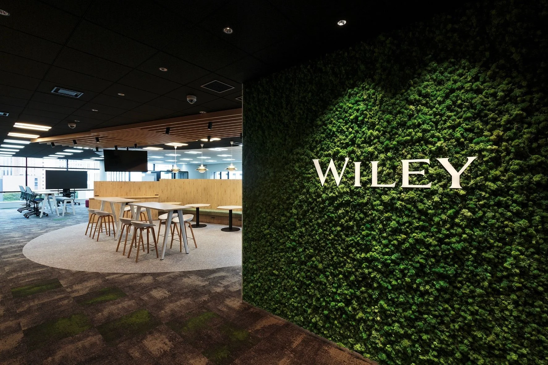
Wiley Rebrand
I developed a new visual identity for 200-year-old publisher Wiley in 2020 to support their new mission statement of unlocking human potential.
The new identity included: elevating the importance of the wordmark on products and in marketing; approachable, purposeful and modern type; a bold, inviting color palette; a photography library with commissioned and stock photography; and bespoke icons.
Brand activation included swag for employees, office recesigns, email and website redesign, and a brand anthem film to play at events.
I authored and designed the brand style guide and continually updated it with brand governance.
Worth Media
As Art Director for Worth, I also refreshed, directed and implemented all design for the Worth brand for all internal and external communications.


Worth Cities
I designed original branding for the various salons and summits under the Worth Cities event franchise. I concepted an overarching brand look and derived individual looks for each event piece from that. I then iterated all logos, social graphics, and created a brand style guide.
Power 100
For the occasion of the 10th Annual Worth Power 100 list, I developed a logo, evolving the previous Power List logo. I added silver ink to the logo and magazine cover as that is the traditional 10th Anniversary color. The secondary color is a modern update to red, the traditional color of power. For the “new Worth” look, we went with a hot coral color. From the magazine usage, the branding evolved for the accompanying summit and all social and marketing around the summit.


Women and Worth 2020
I designed a new brand design for the 2020 iteration of the Worth “Women and Worth” community, which encompassed editorial coverage, podcasts, newsletter and events. I created a branding guide and iterated all logos. I also art directed the brand vision across all platforms, including experiential.


