Branding
Wiley Rebrand
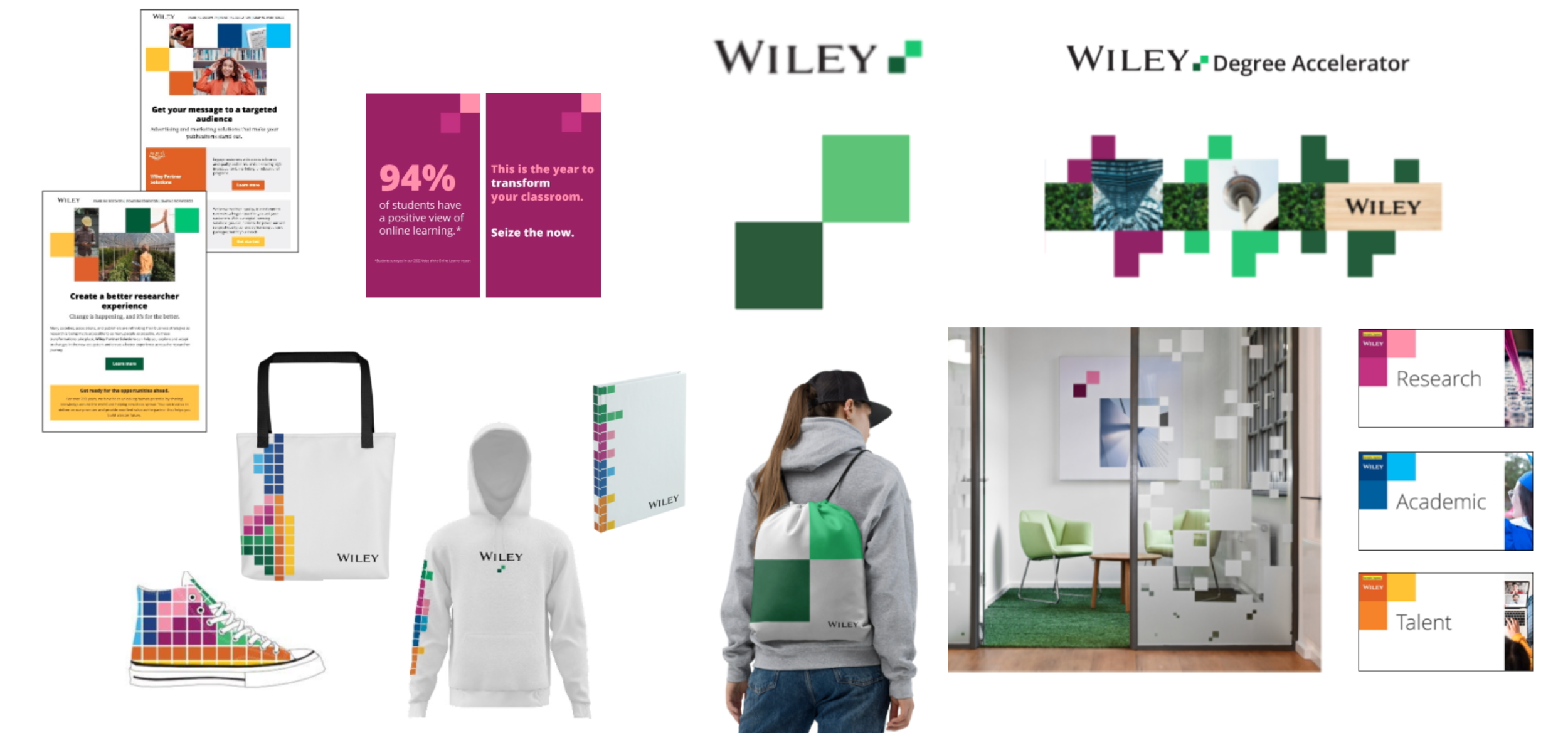
The 200-year-old publisher Wiley rebranded in 2020 with a new mission: “unlocking human potential,” emphasizing its role in advancing science and human progress.
As part of this rebrand, I developed a new visual identity that positions the company as trustworthy, optimistic, fresh, and accessible. From competitor analysis to C-suite approval, template creation to photo library build-out, I managed every aspect of the rebrand.
Key actions taken:
Elevated the visual weight of the wordmark on products and in marketing.
Implemented approachable, purposeful, and modern typography.
Designed a bold, inviting color palette, simplifying it from 30 colors down to 4 for stronger brand recognition.
Built a photography library featuring real people, including commissioned portraits and on-location photography.
Created bespoke icons.
Developed a simplified design language, ensuring ease of use for non-designers.
Introduced a fresh corporate symbol—“the building blocks”—which feature in Wiley-led product logos and all areas of brand activation.
After the rebrand, I activated and extended the brand through digital brand campaigns, brand videos, a full company website redesign, corporate event production, and the rebranding of company offices worldwide.
Worth Media
I was brought on board Worth, a nearly 50-year-old magazine focused on financial, legal, and lifestyle issues for high-net-worth individuals, to help transform it from a traditional print publication into a dynamic, inclusive brand spanning print, digital, and events.
To bring the new motto—Worth: Beyond Wealth—to life, I led key creative initiatives, including:
Key Actions:
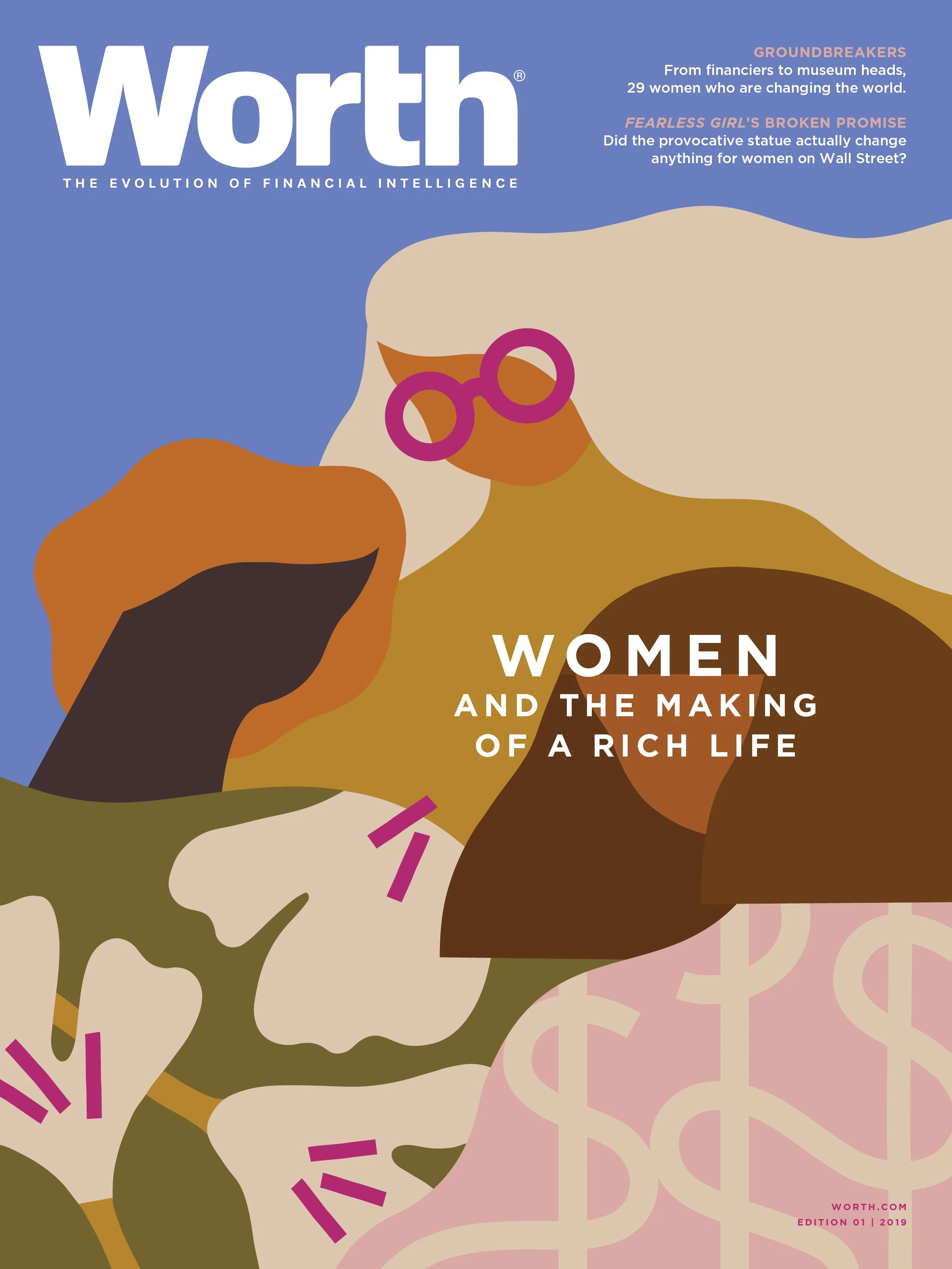
Rebranded the quarterly magazine with a fresh, modern look by incorporating diverse illustrators, higher-quality paper, special cover inks, and an updated color palette.
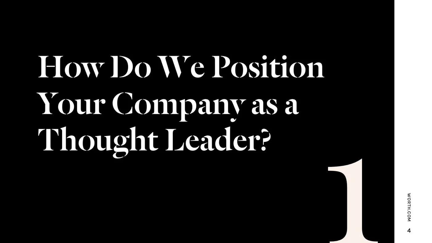
Redesigned all sales and marketing materials, including pitch decks and advertisements.
Provided creative direction and UI design for the website revamp.
Revitalized social media platforms with a cohesive, engaging aesthetic.
Established a central repository for brand assets, ensuring consistency across teams.
Built and managed a team of in-house and freelance designers.
Redesigned internal and external communications, including the Employee Handbook, holiday cards, and stationery.
Worth had a thriving events business, with each event featuring its own unique branding while remaining connected to the main brand. I enhanced this by introducing more impactful visual displays, improving presentation decks, and creating cohesive templates for each franchise in collaboration with the events and marketing teams.
Additionally, I led the redesign of the Women & Worth franchise to align with our broader rebrand, working directly with the CEO to refine its visual identity and messaging.
Power 100
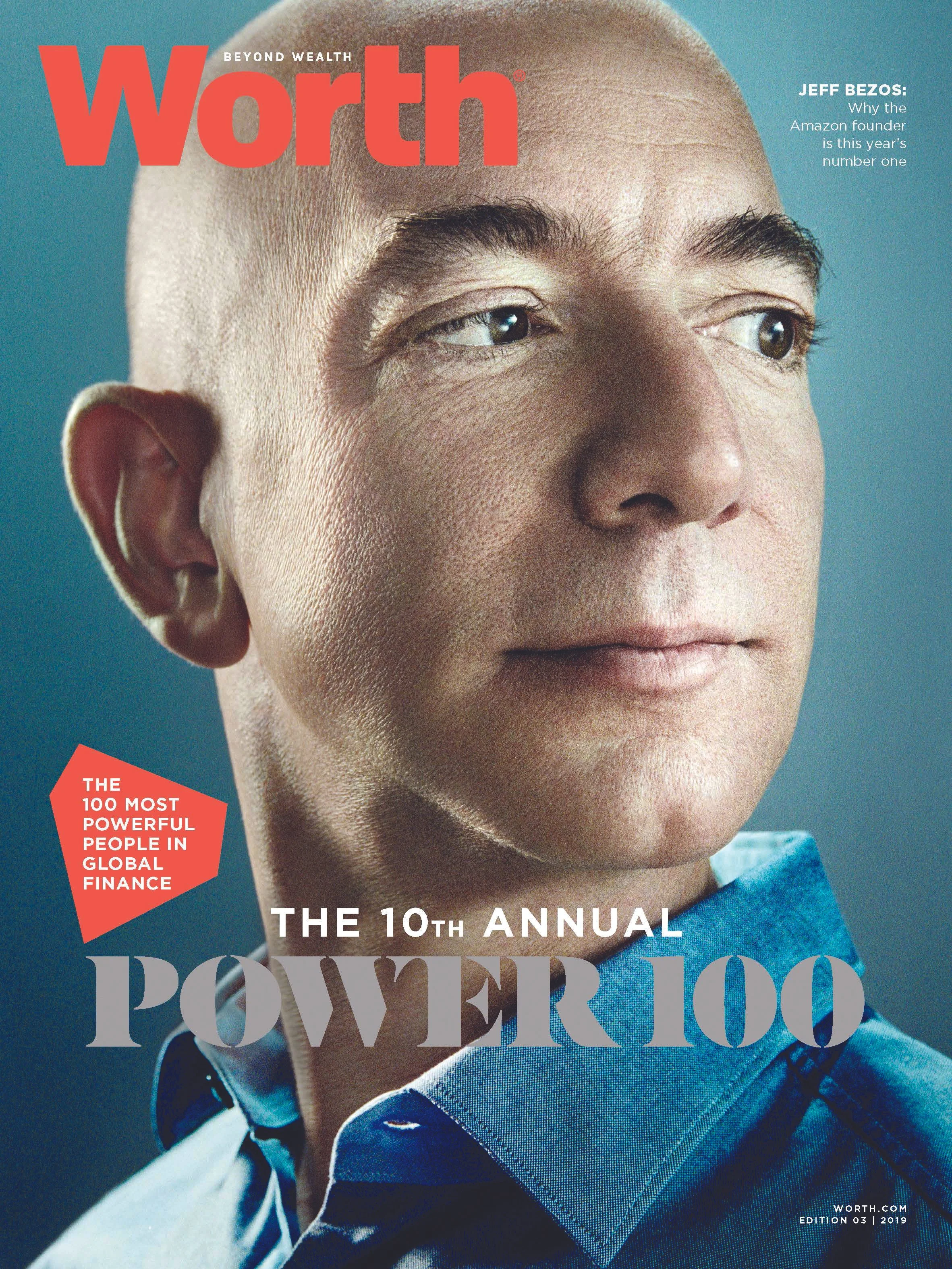
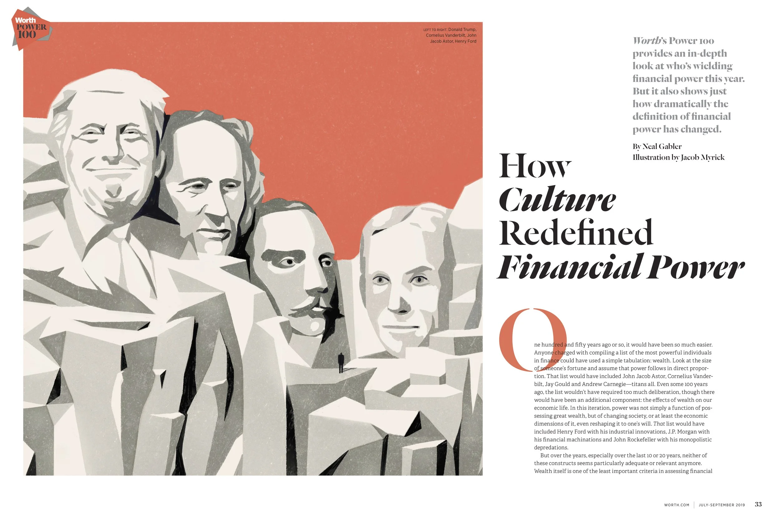
The Worth Power 100 is both a prestigious event and a signature annual magazine feature. For the 10th anniversary edition, I designed a fresh logo that aligned with the brand’s new vision. To honor the milestone, I incorporated silver ink into the logo and magazine cover—an elegant nod to the traditional 10th-anniversary color. For a bold, modern twist on the classic power red, we introduced a striking hot coral, reinforcing the dynamic new Worth aesthetic.
Building on this visual identity, I carried the design through to the summit signage and marketing materials, ensuring a cohesive and impactful presence across all touchpoints.
Women and Worth
I created fresh branding for the “Women and Worth” franchise, which encompassed editorial coverage, podcasts, newsletter and events. I created a branding guide and iterated all logos. I also art directed the brand vision across all platforms, including experiential. See more on the Events page!
Worth Cities
I developed original branding for the Worth Cities event franchise comprised of multiple events annually in different U.S. cities. The overarching brand look spun from the parent Worth brand. I designed all logos, social graphics, and signage and created a brand style guide.


